Report navigation报告导航
One local structure holds overview, review, class / grade views, and student details.以一套局部结构承载总览、讲评、班级 / 年级视角与学生详情。
Redesigned report lists, analytics pages, and classroom review flows into one reusable framework, with AI-assisted demos for faster product-engineering alignment. 将分散的报告列表、学情分析页与课堂讲评流程收敛为一套可复用框架,并以 AI 辅助 demo 加快产研对齐。
I noticed this in daily use: teachers were moving a single report across many inconsistent screens, relearning each layout. After talking it through with product, we turned it into a project. The redesign started before the report page itself — unifying how each report type is listed, opened, drafted, and recovered, so teachers move through one set of rules. 这并非指派的需求,而是我主动发现并立项的:日常使用中,我注意到教师处理一份报告需在多套各异的界面间反复切换,每次都要重新熟悉页面。于是我将这一碎片化的体验问题立项 —— 一次面向教师端报告工作流的重构,覆盖报告列表、详情分析、班级 / 年级视角与课堂讲评入口。重构从报告详情页之前便已开始:统一全部作业、已生成报告、草稿箱与回收站等入口状态,使教师能以同一套规则查找、进入并恢复报告。
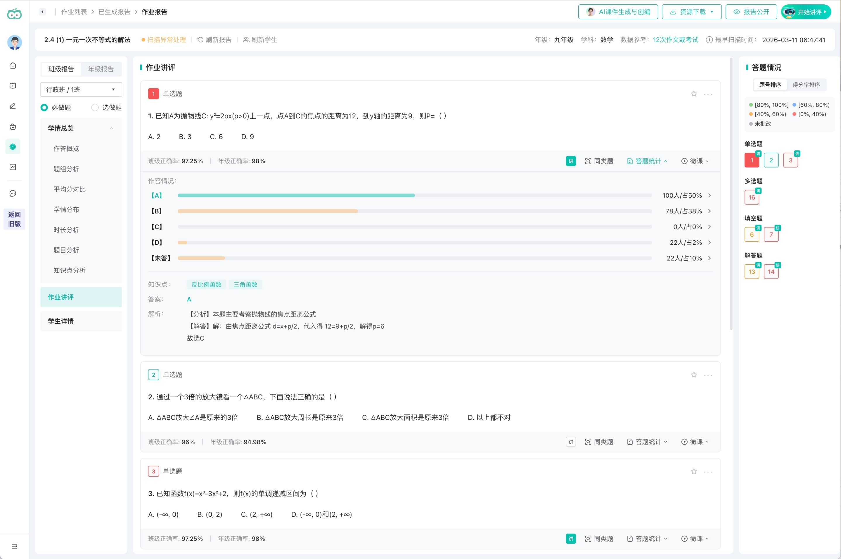
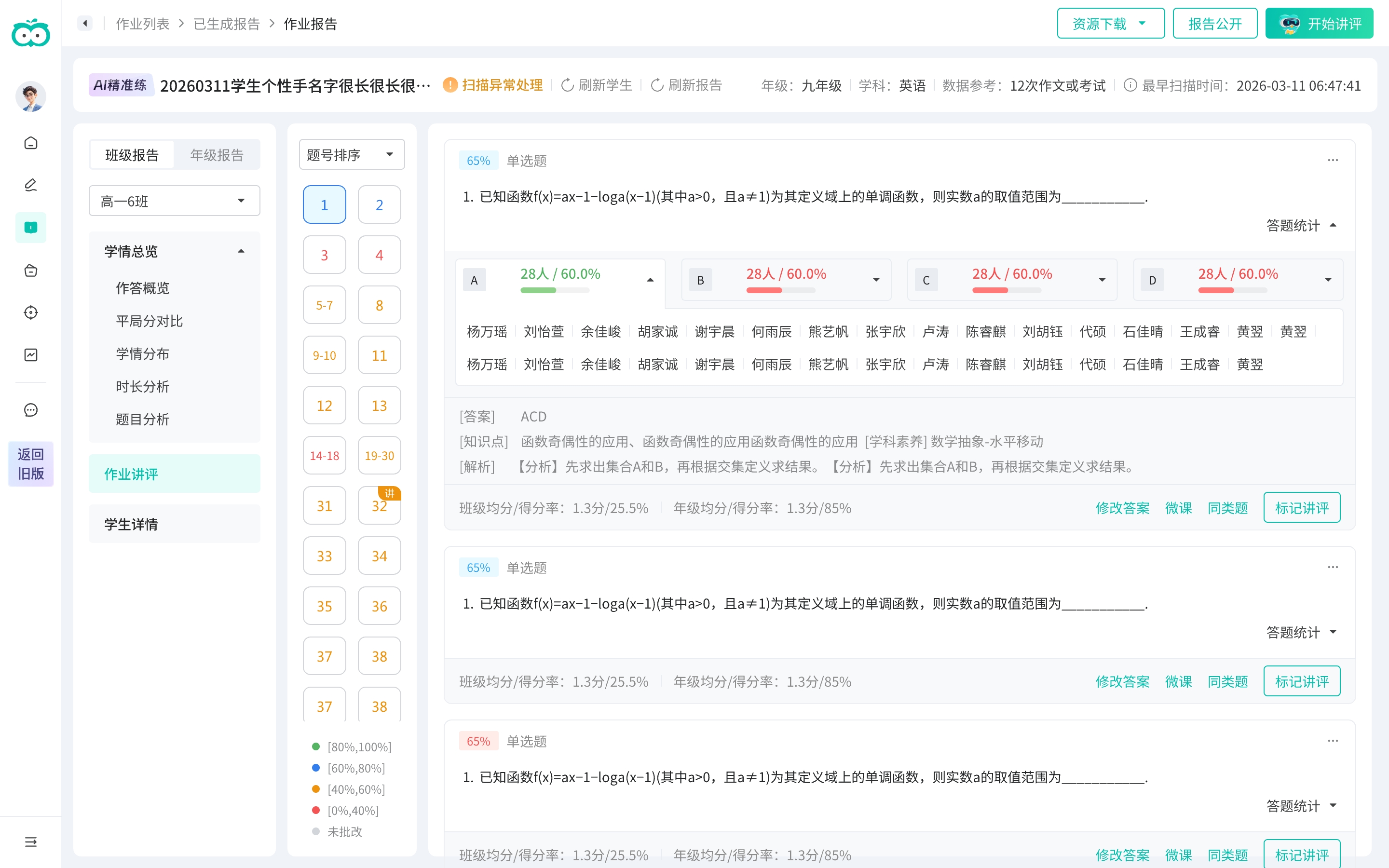
Before unifying anything, I audited the workflow feature by feature — the same action behaved differently across types: exception handling showed a button on some reports and nothing on others, downloads varied in items and naming, answer-distribution panels expanded in different places. Three patterns fell out — fragmented entry points, inconsistent detail structures, and repeated design and build work for every type:动手统一之前,我先逐功能做了一次差异审计 —— 同一个动作在不同报告里各做一套:扫描异常有的报告有按钮、有的没有,下载项和命名不一致,答题分布的展开位置也各不相同。归纳出三类问题 —— 入口割裂、详情结构不一、以及每类都要重复设计与落地:
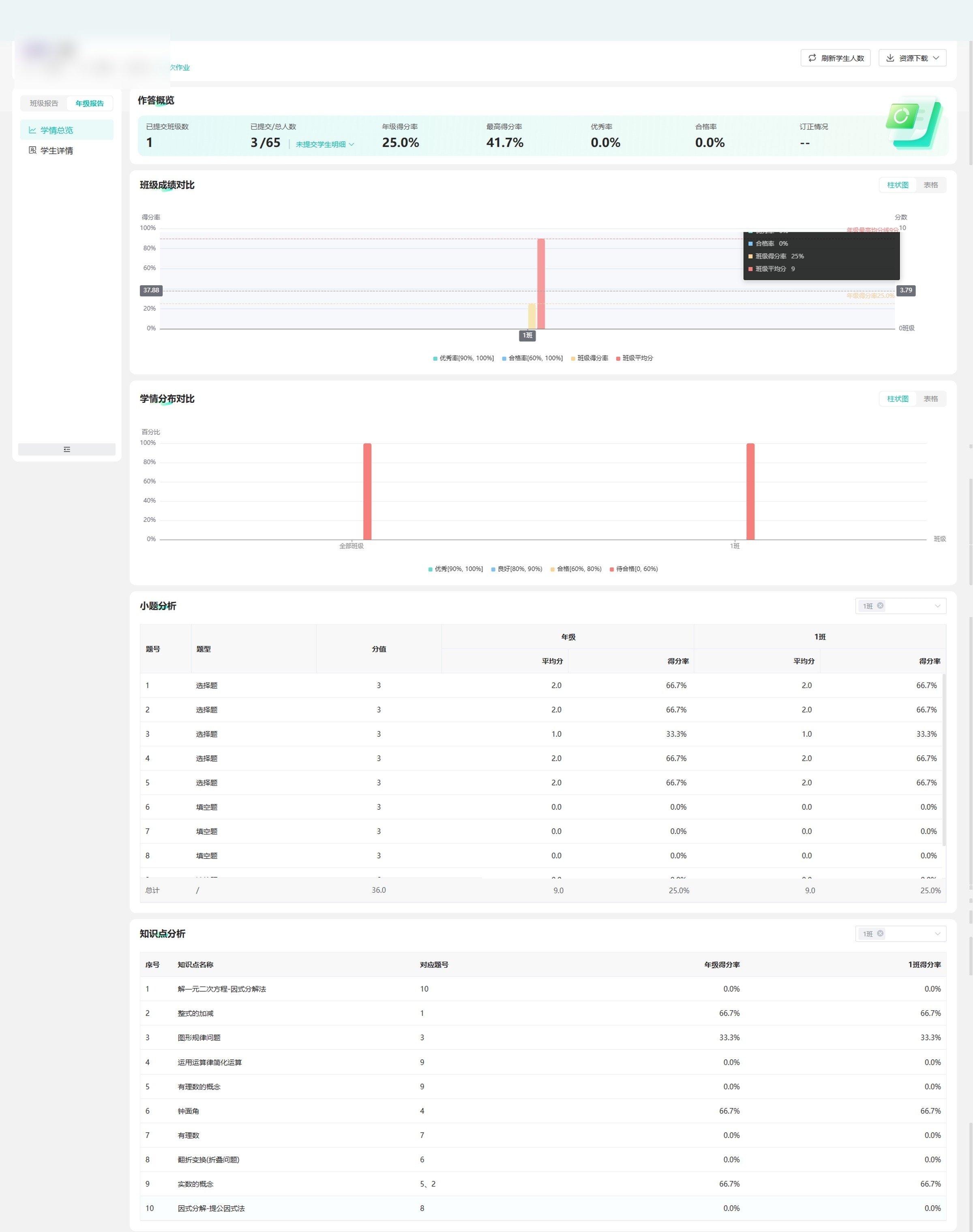
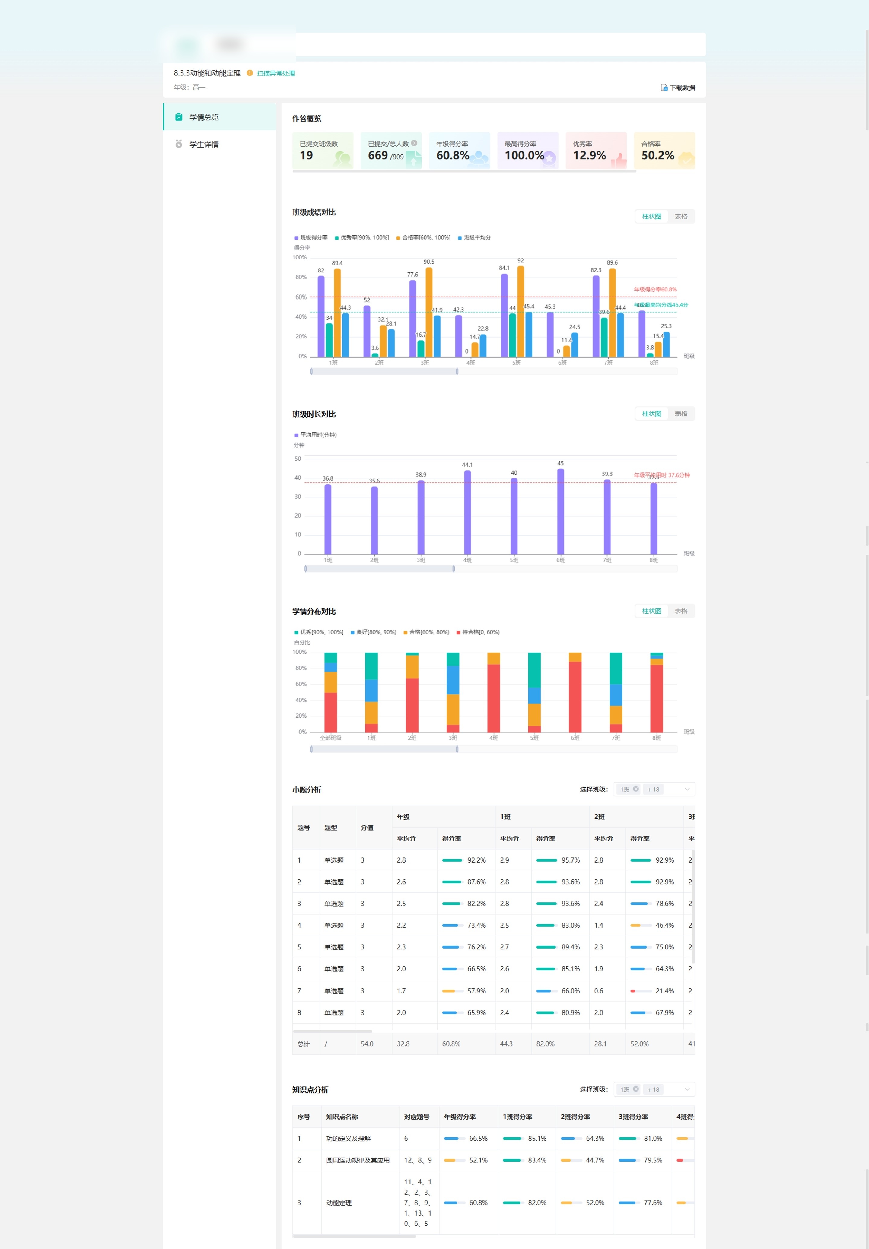
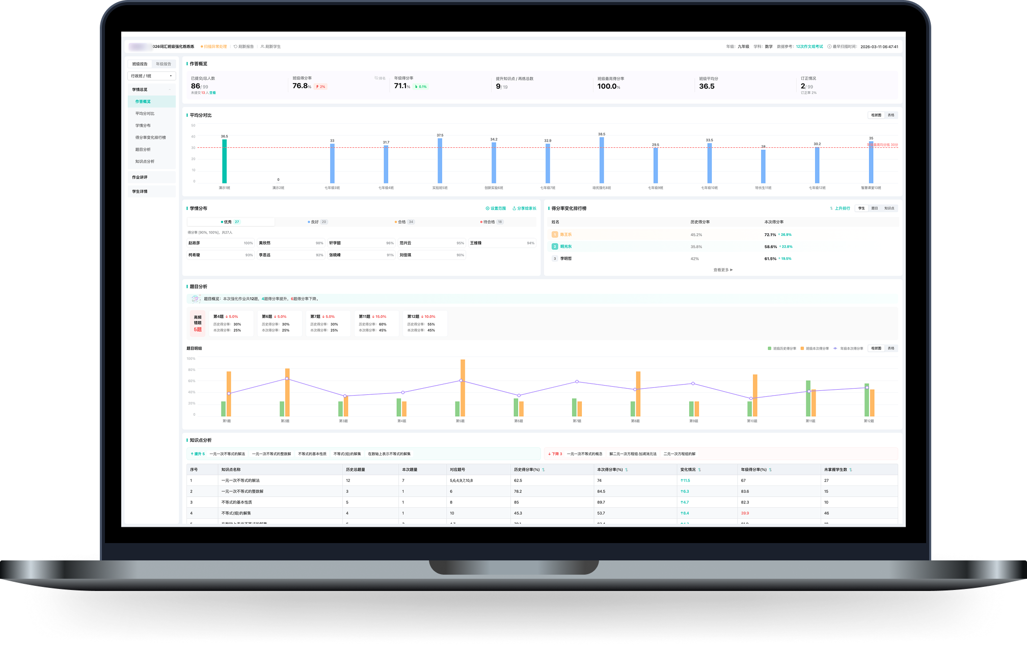
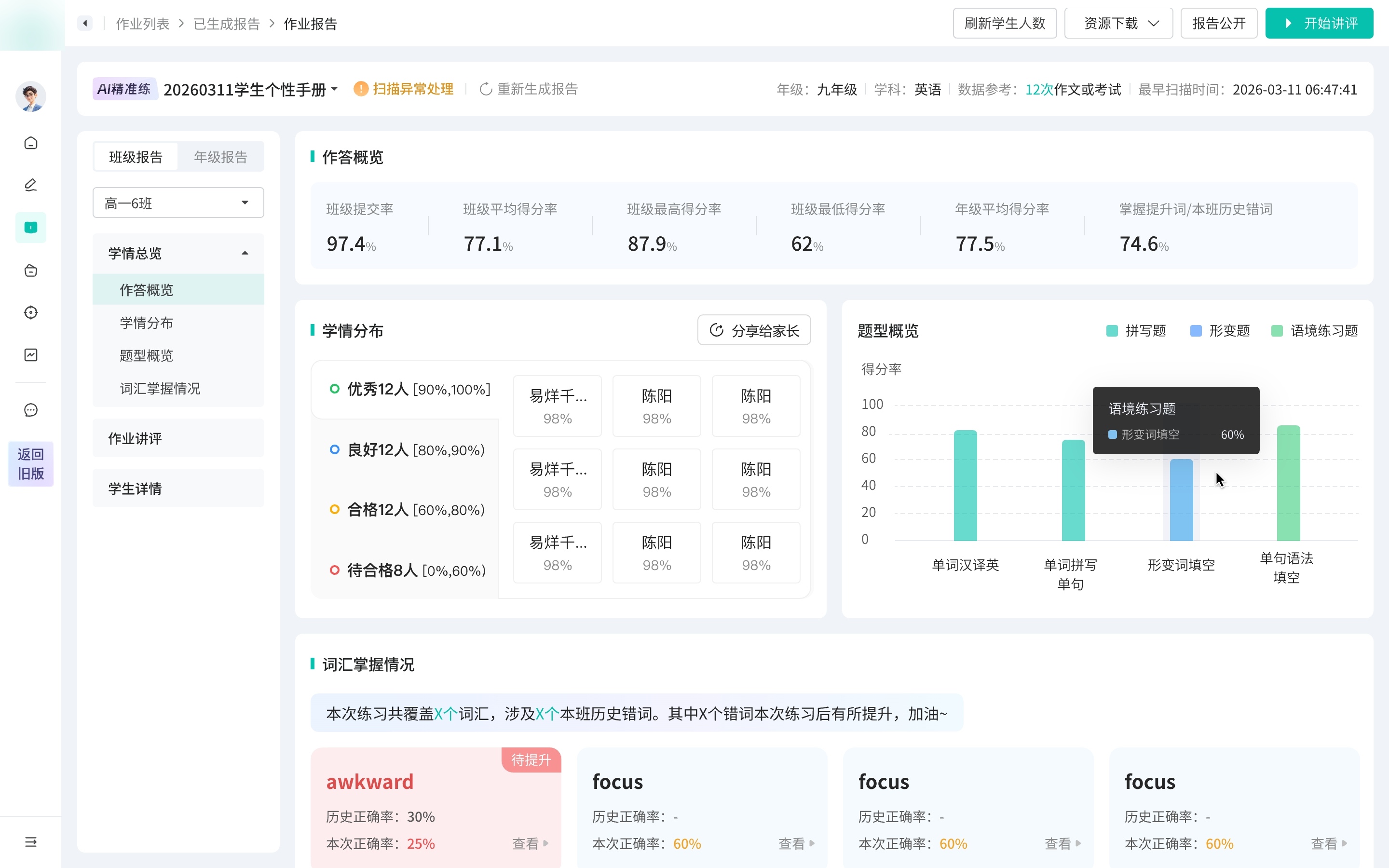
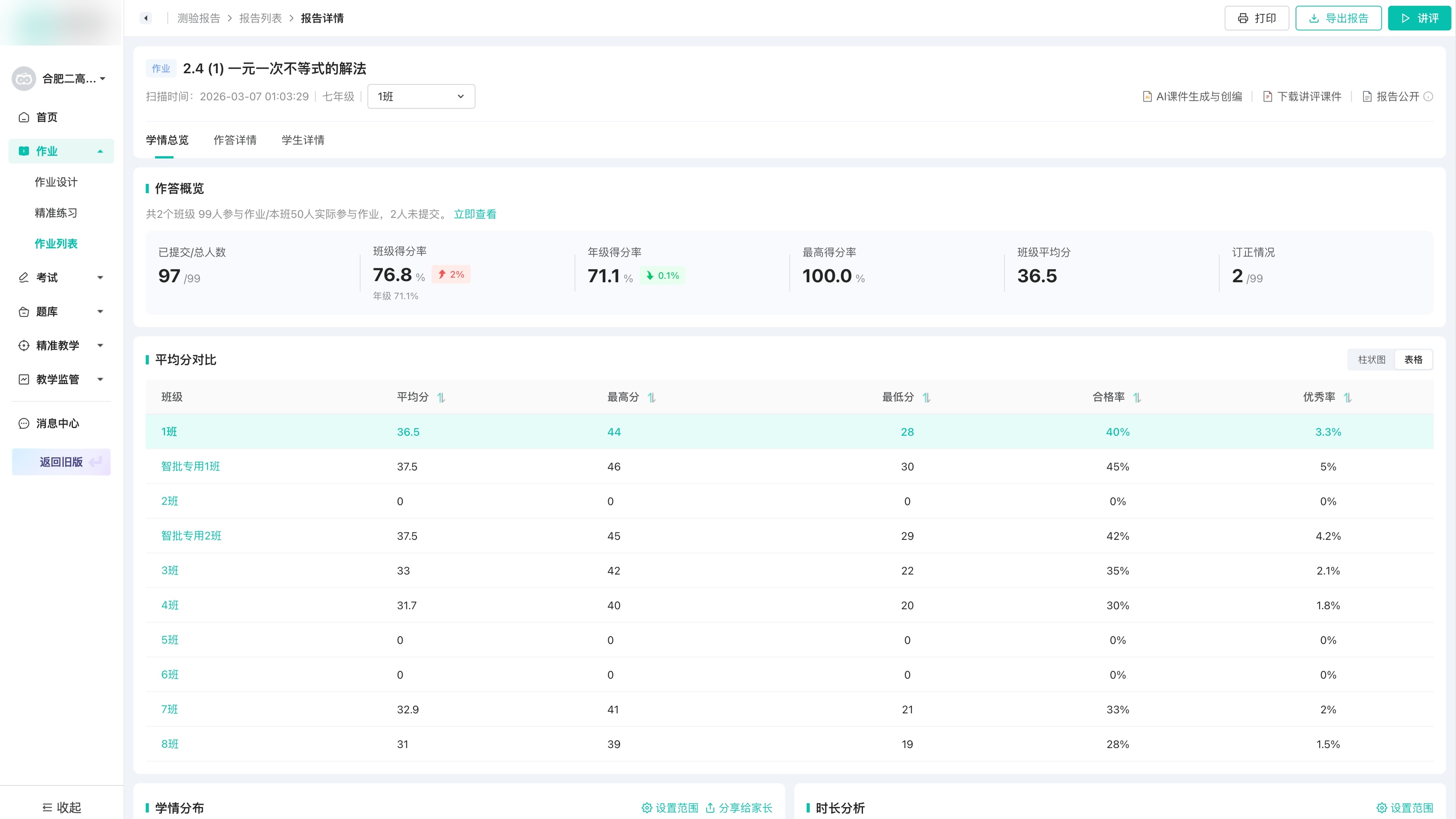
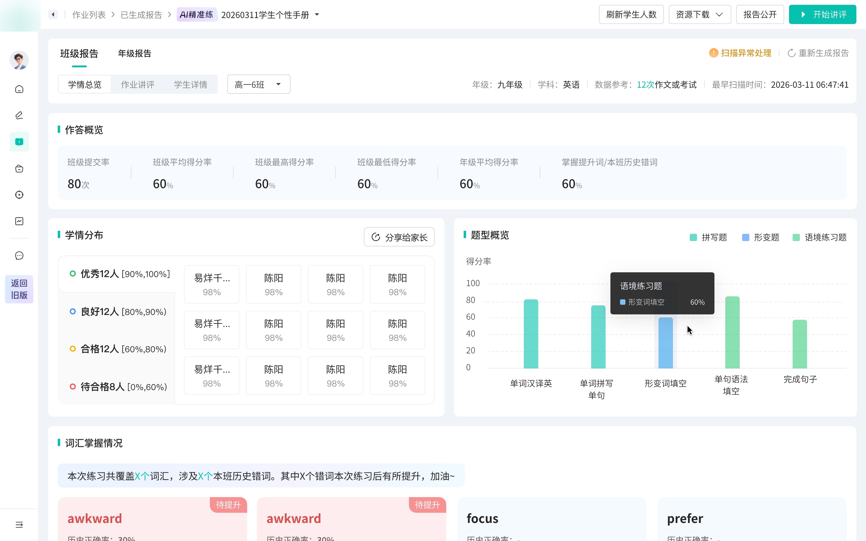
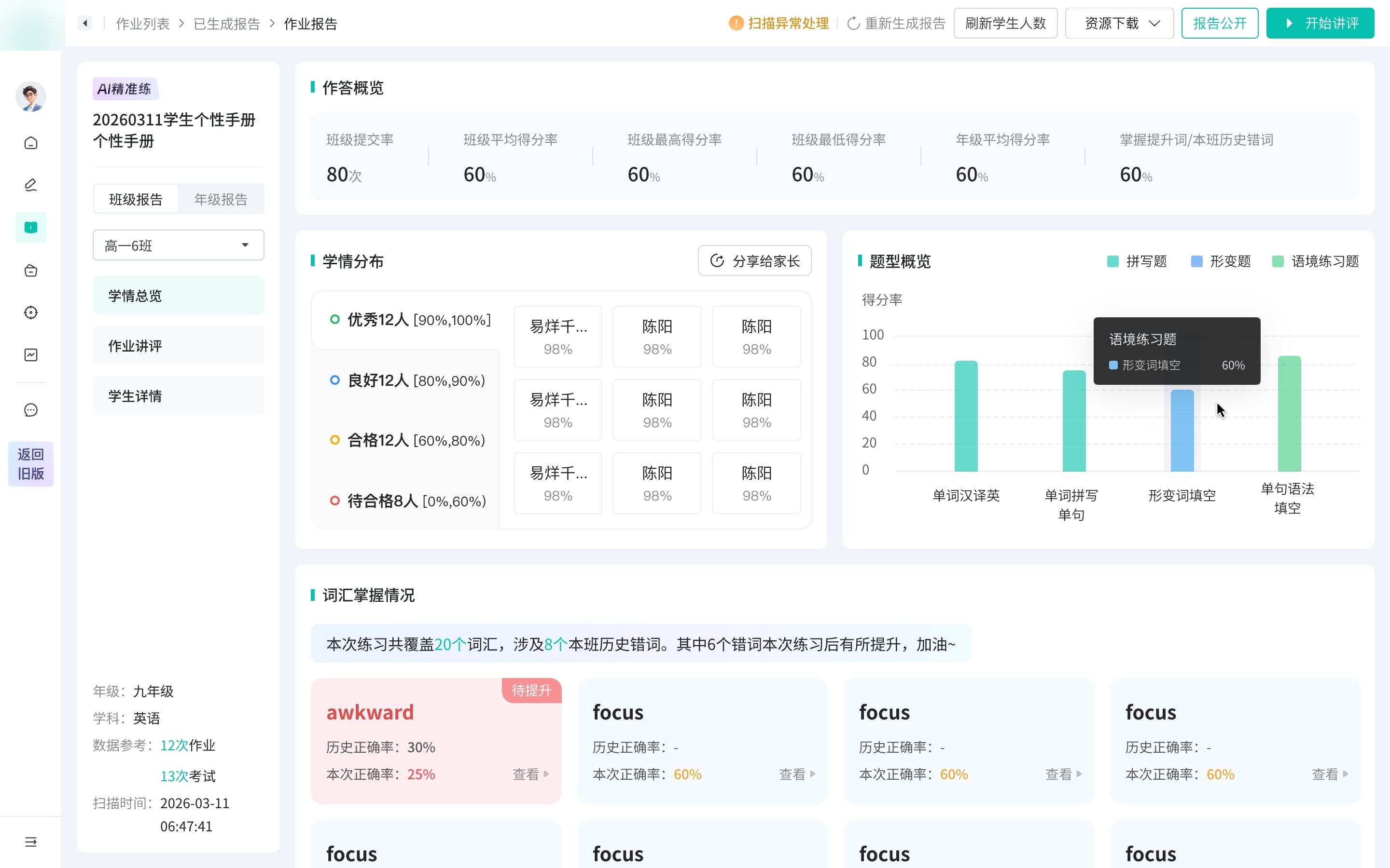
Teacher scenario教师使用路径Teachers needed one predictable path from report entry to analysis and action: find the right report, switch class or grade views, read performance signals, then prepare review or diagnose student issues.教师需要一条稳定且可预期的路径:定位对应报告,进入班级或年级视角,查看表现与薄弱点,再进入讲评备课或学生问题诊断。
The selected framework unified the path around the report — find, enter, navigate, act — while leaving each report’s modules free to differ. Get that line wrong and 8+ report types, each split across class and grade views, lock into one rigid structure. 最终框架统一的是报告的外层路径 —— 查找、进入、导航、操作 —— 同时让各报告的模块保持差异。由于这套外层要同时支撑 8+ 种报告(每种再分班级 / 年级两层),边界一旦界定不当,后续扩展都会受制于它。
Tradeoff代价extra upfront structure: the shared shell needed clearer local navigation rules, but it made later report types easier to extend.前期结构定义更重,共用外壳需要更清晰的局部导航规则,但后续报告更容易扩展。
One local structure holds overview, review, class / grade views, and student details.以一套局部结构承载总览、讲评、班级 / 年级视角与学生详情。
Export, sharing, and review entry points stay centralized across report types.导出、分享与讲评入口在不同报告中保持集中。
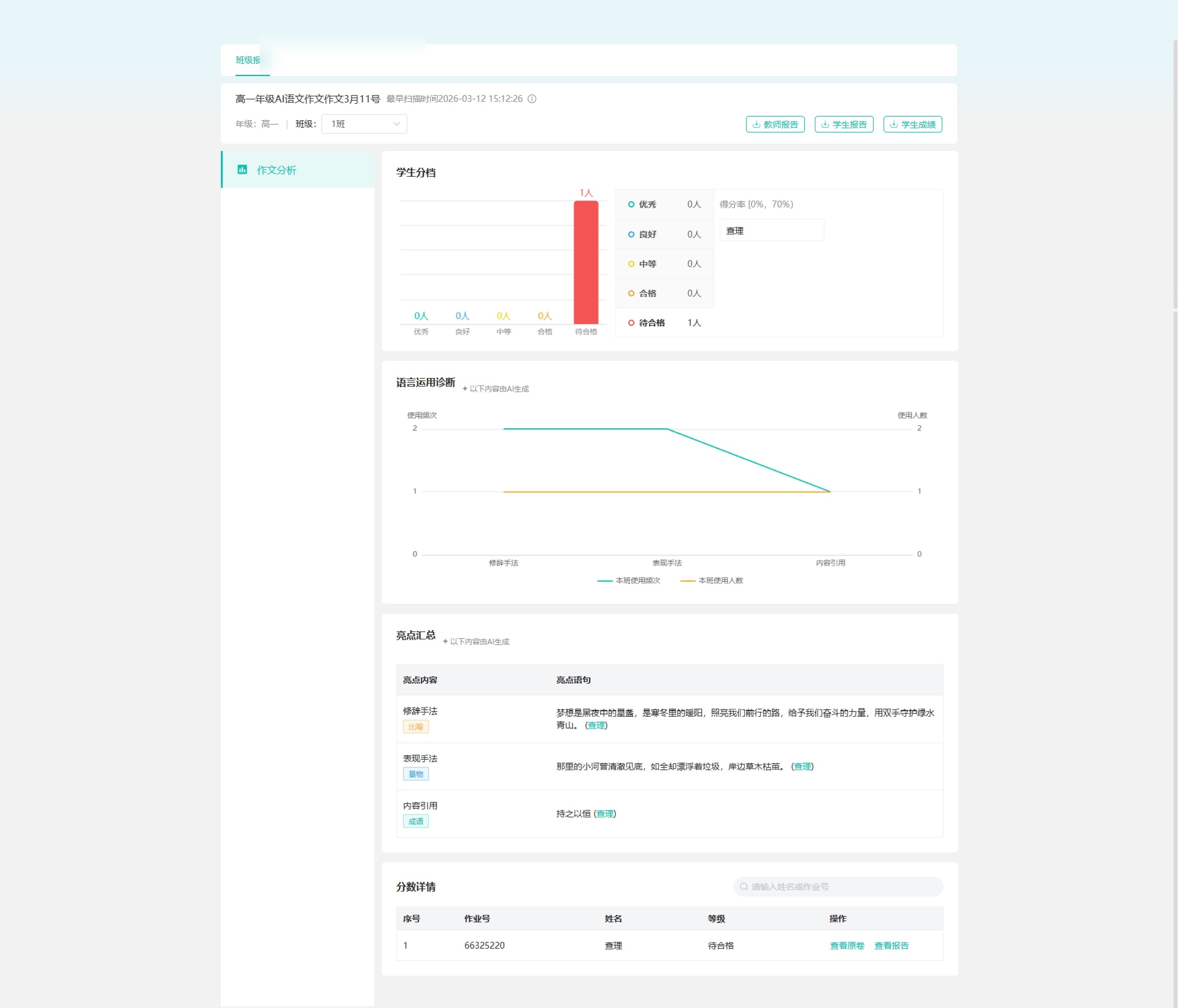
Analytics, question types, and review content can vary inside the shared framework.分析、题型与讲评内容仍可在共用框架内变化。
I evaluated each direction against three requirements: report-task focus, clear internal report navigation, and enough space for analytics and review. 我以三条要求评估每个方向:报告任务是否聚焦、报告内部导航是否清晰、分析与讲评空间是否足够。
 Explored 01探索 01
Too close to the legacy structure; report-task focus remained diluted.过于延续旧结构,报告任务聚焦不足。
 Explored 02探索 02
Fit the new shell, but internal report navigation remained underdefined.贴合新版外壳,但报告内部导航仍不够清晰。
 Explored 03探索 03
Clarified metadata, but compressed analytics and review space.元信息更集中,但压缩了分析与讲评空间。
I split the work by decision risk: the higher the cost of a wrong call, the less I let AI decide. 我按决策风险拆分工作:判断失误的代价越高,越不交给 AI。
AI handled the routine pages — list states, and the report IA inside a structure I set first.常规页面交由 AI —— 列表页、状态页,以及在我预先确定的结构内的报告 IA。
The classroom review is where design judgment had to lead.课堂讲评,是设计判断必须主导之处。
It decides how a teacher runs the lesson — not something to hand off. Iterating with AI also trapped me inside what it could already produce; turning it off was how I kept room to diverge.它决定教师如何组织这堂讲评 —— 不应交由 AI 代劳。而且反复借助 AI 迭代,思路容易被局限在它已能产出的范围之内;暂时停用,是为了保留发散思考的空间。
Reusable components were cleaned by hand, then written back to the design library through an MCP-based workflow — and the branch and API changes were handed to engineering.可复用组件经人工清理后,再经由基于 MCP 的流程回写至设计库;分支与接口改动随后交付研发。
The result was structural, and the reuse is concrete, not aspirational: empty and loading states are no longer drawn per report — they reuse one shared set from the codebase; and components built while prototyping are written back to the design library through an MCP workflow, so the next report type starts from a fuller kit, not a blank page. 结果是结构性的,且复用切实可见、并非口号:空状态与加载态不再为每种报告单独绘制,而是复用代码仓中的同一套;在 demo 中新建的组件又经 MCP 流程回写至设计库 —— 后续报告可基于更完整的组件库展开,无需从零开始。
On the numbers关于这些数字The 140k+ monthly reach is product scale, not redesign-driven growth. I don’t claim a percentage impact, because rework reduction was never formally measured.14 万+ 月触达是产品规模,不应归因于本次改版。返工减少未经正式统计,故不声明百分比影响。
What I’d do differently复盘Early on I hadn’t balanced fast delivery against high fidelity, and a stretch of work went the wrong way before I set the rule — stabilize the framework first, fill content second, keep a hand-drawn fallback for the hardest pages. The redesign also still needs real validation: the signal to watch is how teachers migrate to the new framework, not the absence of complaints.项目初期未能先对齐“快速交付”与“高完成度”,中途出现过偏差;此后我将其收敛为一条原则 —— 先稳定框架,再填充内容,最难的页面保留一份手绘稿兜底。此次改版也仍需真正验证:真正应关注的是教师在新框架下的迁移与使用情况,而非“无投诉”。
The real design decision was not whether to use AI. It was deciding what to hand off, what to unify, and what needed to stay in the designer’s hands.真正的设计判断不在于是否使用 AI,而在于:哪些可以交付出去、哪些需要统一、哪些必须留在设计师手中。